Website design is so crucial to your business’s success. There are many easy mistakes so many of us make when it comes to website design. These mistakes can drive consumers away rather than get them to engage and convert.
Let’s turn that ship around. It’s easier than you might think to boost your conversions and create a much better experience for your clients. In this blog, we’ll explore some key psychological principles you can leverage to enhance your site visitors’ experience.
The secret is, that you need to consider how a web user’s mind works when creating your website design.
We’ll teach you how to take decision-making, meaning, and connection into account. At the same time taking into account typography and color, so you can maximize your site’s effectiveness.
Table of contents
1. Present ‘wow’ moments
Evoke a sense of wonder and a meaningful experience for clients and leads when they visit your page with great website design, whether that’s with visual content such as a beautiful, colorful image or with something playfully interactive.
Make emotional marketing design principles work for your site by leveraging elements that trigger a visceral – i.e. gut – reaction rooted deep in our psyche and biology. If you can stimulate emotions such as surprise, delight, hatred, or disgust, you may just get your audience to ‘care and share’ (and convert).
Such ‘wow’ moments are inherently shareable which makes the visceral content you create ideal material for your Social Media Marketing strategy. Remember that posts with images result in 180% more engagement than those without while consumers are 85% more likely to invest in a brand after watching a video about it.
2. Reduce the effort required

Cut down your form fields. Eliminate supplementary CTA buttons. Minimize the consumer’s options. This is called the Paradox of Choice, or Hick’s Law. The more effort required of a person to fill in fields or pick one of many, the longer they’ll take to respond and, ultimately, the less likely it is they’ll convert. Even a distracting website can have the same effect.
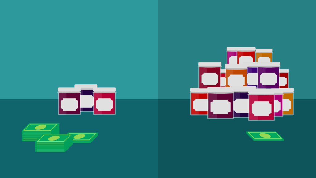
People just don’t like being overwhelmed. This principle is best exemplified in the world-famous jam study, whereby researchers had 24 jams on sale at a food market, then the next day just 6. By greatly reducing the varieties of jam on offer, sales increase tenfold. Fewer options = More sales.
Providing this kind of subtle direction gives your leads a simple, enticing action they can do, resulting in quicker and easier conversions. Everyone’s a winner!
3. Choose the right typeface
Logos and copy in specific kinds of font elicit significant emotion in readers. This is why choosing the right typeface to communicate your brand correctly is so important in website design. Read through the examples below for some basic feelings and psychological associations with each kind of typeface, and take a look at this for some ideas.
- Script connotes elegance, sophistication, and affection (example: Cadillac)
- Serif is traditional, respectable, reliable, and comfortable (example: Google)
- Sans Serif is clean, modern, chic, and objective (example: Appscore logo)
- Display fonts are amusing, friendly, expressive, and unique (example: Disney logo)
4. Use Storytelling in Website Design

Use storytelling in your site copy to draw users in. Humans like other humans, so be real. Evoke wonderful scenarios your readers can transport themselves into with your words and watch your conversions soar.
Relative findings suggest a product’s value can increase more than 40-fold with good storytelling. Experimenters put a selection of cheap and tatty thrift-store goods up for auction and asked notable writers to pen purpose-written short stories in place of the standard description. The 100 objects bought for $1.25 each on average sold for $8,000 total. So tell your story from the heart, using these handy tips.
5. Consider how colors work
You can do better than pick a color scheme just because you like it: you need to think about what those colors signify. For example, green is calming and evokes trust, while blue remains the overall most popular ‘favorite’ color. Do your colors speak to your target demographic? Among women, purple is popular, while among men it’s less so.
There are some differences between genders and ages but, the bottom line is, color matters. Research consistently finds similar results stating that around 85% of consumers value color as a primary reason for making a purchase decision
Famous psychologist Robert Plutchik developed a revolutionary theory of emotion in the 1980s, visualized with a graphic color wheel. The reference material is used by marketers around the world to aid decision-making to this day, albeit with slight adaptations.
FAQs
What are the 3 types of web design?
Web designing is of three kinds, to be specific static, dynamic or CMS, and eCommerce.
How many hours does it take to design and build a website?
A website may be developed in between 150 and 500 hours. If you are having a technical partner develop your website, the process will go through several stages. the phases of project discovery, design, development, and website updates.
Is it hard to create a website?
With website builders like Squarespace, it’s quite simple and doable to design and create your own website. However, if you want something more personalized and made to your exact specifications, it will take some time to understand the platforms and technologies required.
How much money do websites make?
When users interact with adverts on websites, usually by producing impressions, interactions, or clicks, websites make money. For instance, an advertiser may provide a publisher 20 cents for each click. The publisher makes $10 per day, or $300 each month if their advertisement results in 500 clicks each day.
Final thoughts
After all that we hope you’ve learned some useful tips for optimizing your website design based on psychological research. Is it playing mind tricks? Nope – just effective marketing!
It is likely that you will not be doing the website design by yourself. So, design psychology should be discussed when you meet a professional web design business. Experts in the field always take into account how particular site components will persuade visitors to do, or refrain from taking, particular activities.
Now you know how the psychology of web design includes how colors, spacing in the design, and even typeface can affect a viewer’s mood. These elements come into play along with emotional elements in web design to give viewers certain impressions and feelings about your business and product.
Once your website design is done and complete, an essential step to look at is SEO. We highly recommend this digital marketing activity to boost conversions. If you have time, we invite you to an obligation-free consultation with our team.


